Choosing a colour theme for your brand imagery shoot.
We use colour all the time symbolically to communicate without words and these symbolisms run deep, often shaping our perspectives unintentionally.
In fact, it just might be impossible to get through a whole day without seeing or using colour as a communication tool - think of the yellow triangle road signs you see daily on your commute.
As a brand, we can also utilise colours subtly or loudly within our marketing imagery that associate certain feelings to our brand.
Take for example, the colour pink and the brand, Girls Get Off. 💗🌸

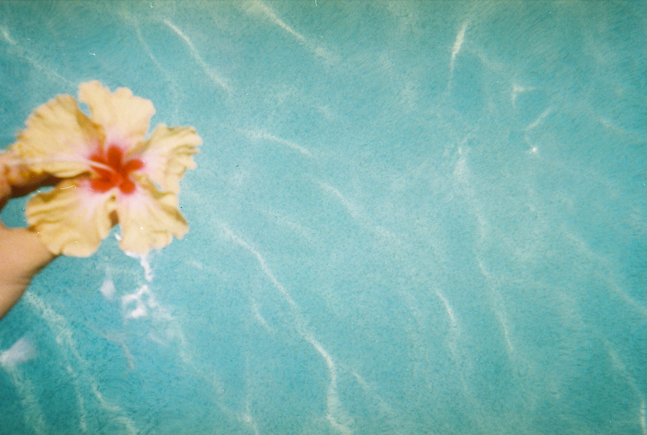
Image by @tastefullystudios
🌸 GGO use pink as their only brand colour which is symbolically associated with Playfulness, Youth, Love, Femininity, and Good Health and they use this colour loudly (as in literally everything in their branding is barbie pink, see here) to relate/attract/communicate with their widely female (and men shopping for their females) audience.
💗 The symbolism of pink also works as a powerhouse boost to their hilariously sassy and trendy communication style which aims at de-stigmatising female pleasure so that the GGO shopping experience is empowering, sexy, and fun for their customers.
Here’s an example of a few other colours and their common symbolisms:
💙= Wisdom, Serenity, Masculinity
💜= Nobility, Whimsical, Independence
🤍= Innocence, Simplicity, Purity
🖤= Power, Elegance, Mystery
❤️ = Passion, Strength, Intensity
🧡 = Joy, Creativity, Determination
💛= Energy, Optimisim, Caution
💚 = Nature, Freshness, Prosperity
Choosing a colour theme for your branding photoshoot
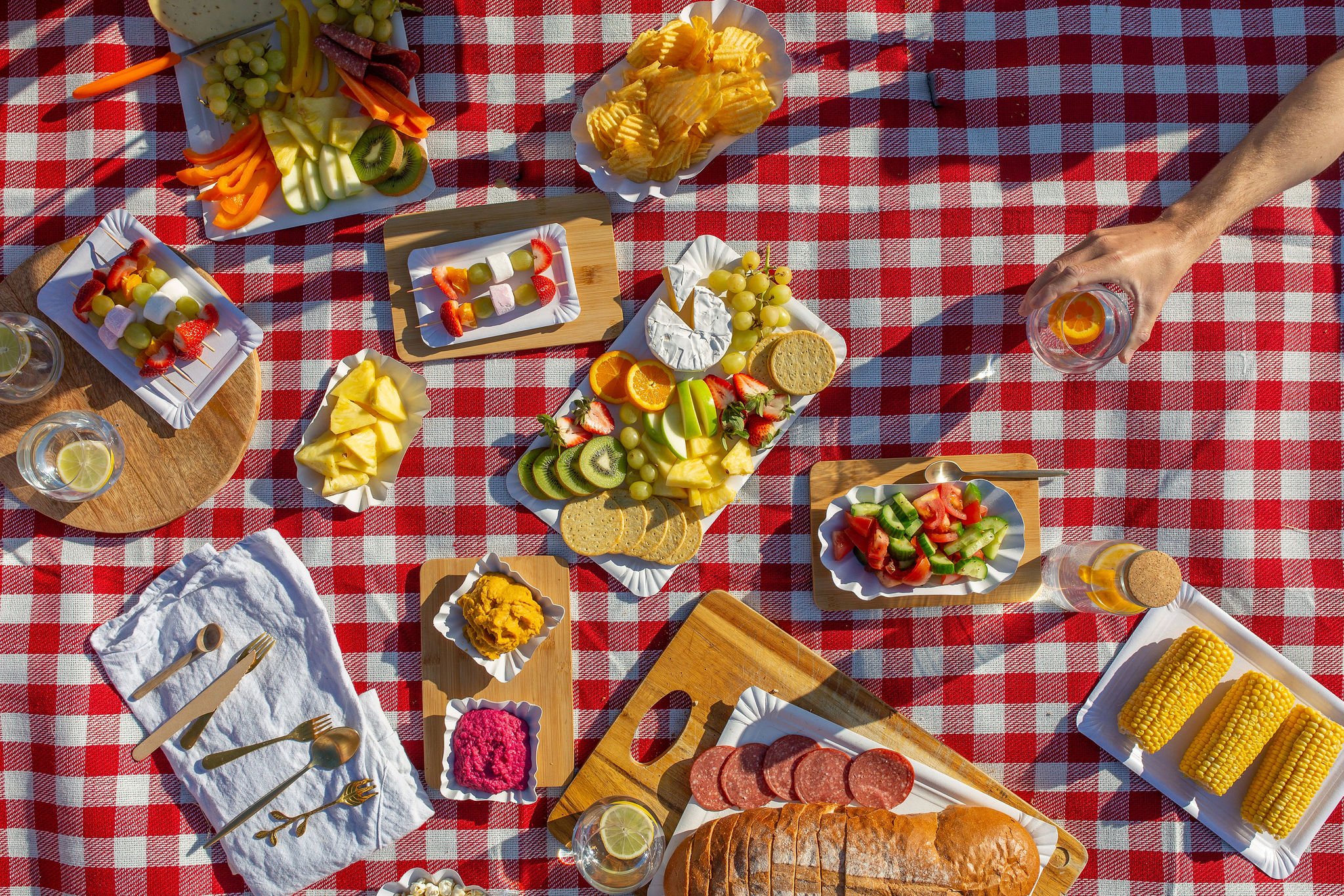
Colour theme: ‘primary colours from a summer bbq’
Your colour theme is something I’ll ask about during your pre-shoot strategy session.
It’s an important piece to any branding shoot, not only for what it communicates but also because it dictates how we plan for backdrops, clothing, and styling.
Colour themes can vary depending upon the content - for example fashion brands might have different colour concepts for each collection.

Colour theme: Client’s brand colours & its compliments
A good place to start though is with your own branding colours. How do you want to incorporate them into your shoot (if at all)?
Since there’s a good chance your images will be sitting against your brand colours in some context (website or other marketing material) consider what colours compliment your brand colours.
If your intention with your brand imagery is focused on generating a specific emotion in your audience - think fomo, hunger, excitement - then consider what colours and colour styles will help you communicate that best - bold colours, bright colours, neutrals, etc.
For example, colours in the pinks, reds, and orange category tend to get our heart rates going. So these would all be great colours to use if you’re hoping to generate excitement.
For more research and inspiration, start collecting relevant imagery that inspires you for the shoot - check out pinterest or even similar brands for ideas to riff off of.
If you’d like more helpful tips to help you prepare for your next branding photoshoot, download my Photo Branding Guide here.